Navigation
Navigation
The header, navigation and footer are the most consistent and important components to the .com system. They are composed of best practices, testing and research, all with the user in mind, to produce optimal click through rates. The MichaelKors.com header is composed of a sticky PPD, the main navigation. This navigation contains both images and text links. These components are NOT open for interpretation.
! DO NOT Manipulate or recreate the navigation in any way. Do not stray from the provided layouts. Contact Lorem Ipsum, Creative Services for any additional information.

Three Column Fly-out Nav
As a fixed height, this fly-out nav is activated by the user mousing over the main navigation with the exception of Destination Kors and Search.

Two Column Fly-out Nav
This iteration of the fly-out only has Categories without any Shops. As a fixed height, this fly-out nav is activated by the user mousing over the main navigation Destination Kors and Search.

Destination Kors
As a fixed height, this fly-out nav is activated by the user mousing over Destination Kors in the main navigation. The main navigation that is situated under Destination Kors is revealed, allowing the user to access a secondary nav to additional content.

Search
As a fixed height, this accordion search field is exposed by the user mousing over Search in the main navigation.

Sticky Utility Nav
This navigation is always stuck to the top of your browser with easy access to My Account, Shopping Bag and Store Locator.

Location-based Breadcrumbs
Establishes the location of the current active page within the site map. Each item in the breadcrumb is a clickable link that drives the user to that expected page. Links are in Cool Gray 7, separated by the arrow icon. The active link is bold.

Sticky Bottom Nav
The persistent sticky bottom nav with secondary category links is only present on category landing pages. In all cases these are centered with fixed spaces between each category.

Left Nav
The left nav appears on all Product Grid Pages. To showcase brand initiatives, Featured Shops goes to the top, followed by Categories.

Mobile Menu Nav

Hamburger Nav Exposed
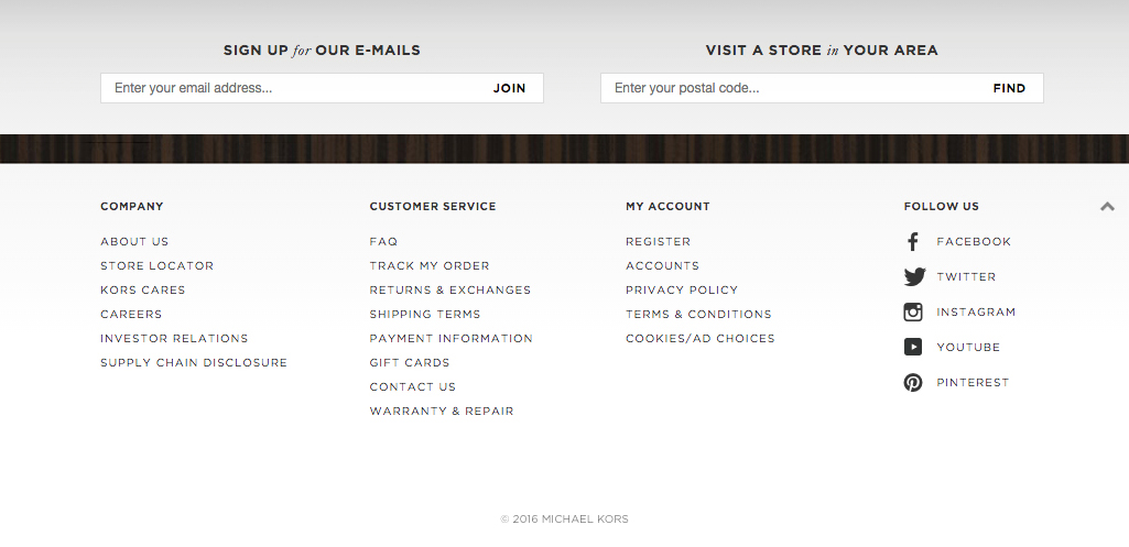
Footer
The header, navigation and footer are the most consistent and important components to the .com system. The footer is located on all pages.
! DO NOT Manipulate or recreate the header in any way. Do not stray from the provided layouts. Contact Derick Bonilla, Creative Services for any additional information.
Expanded
The footer is auto expanded on load and is bound by a top gray drop-shadow with a gray gradient background. It is always positioned at the bottom of the site pages and contains signup for emails, store locations, additional company information, quick links to customer services, quick links to account information, social media and copyright information. All links and icons are black. The user has the ability to collapse the quick link area. Do not alter the links or icons.
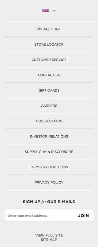
Mobile Footer
Interactive
Buttons
All MichaelKors.com buttons are listed below. Do not use any additional button styles. Use primary and secondary buttons to establish hierarchy within the site and user flows. Copy is always centered except in the social media buttons, which are left aligned.
! DO NOT Add additional button styles. Contact Lorem Ipsum, Creative Services for any additional information.
Rollover the primary, secondary, secondary with icon and secondary with messaging buttons to see button animations.

Primary Button

Disabled

Secondary Button

Secondary Button Stacked

Secondary Button with Icon

Secondary Button with Icon Stacked
Secondary Button with Messaging

Social

Social Option

Play Button

Back to Top
Links
Primary, Secondary, Secondary with Icon, Secondary with Emphasis and Inline text links should always be displayed as shown below. Do not alter or stray from the below designs.
! DO NOT Alter or add any additional link styles. Contact Lorem Ipsum, Creative Services for any additional information.
Rollover the primary, primary with icon, primary stacked and primary stacked with icon links to see link animations.

Primary Link

Primary Link with Icon

Primary Link Stacked

Primary Link Stacked with Icon

Secondary Link

Secondary Link with Icon

Inline Link

Secondary Link with Emphasis
Icons
These are the only icons used for Michael Kors and establish a strong visual association to social, navigation and general utilitarian usages. Icons are always black and can be inline, stand alone or displayed with a slug.
! DO NOT Add icons, alter or recreate these icons in any way. Contact Lorem Ipsum, Creative Services for any additional information.
General Icons
Navigational Icons
Social/Share Icons
Filter
Filters are exposed from the PLP when clicking on one of the corresponding filter by attributes (color, prices, collection, bag category and bag group). Adhere to the below styles for the PLP filtering components when using drop-downs, check-boxes and color selectors. These assets have been designed to improve the customer experience with a user-first approach while maintaining the brand’s look and feel. All of our filters are customized and are for both Desktop and Mobile executions. A filter selection is added as a breadcrumb and can be deleted at any time.
! DO NOT Alter the design, size, color functionality or type. Do not use the native selectors. Contact Lorem Ipsum, Creative Services for any additional information.

PLP Filter

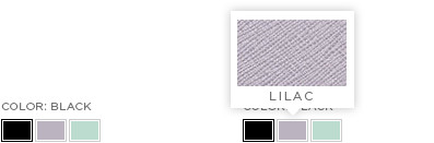
PLP Filter by Color

PLP Filter Bag Group
Sort

PLP Filter
Modals
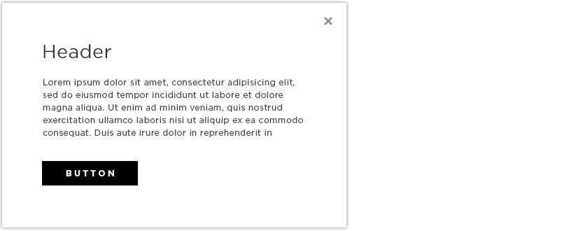
Michael Kors only uses modals to enhance the user experience. Our modals help the user by prompting additional information about a product and value. These are seen as a helpful tool to increase the users’ experience. They are an overlay to the site experiences paired with an obvious close button. They are classified as a white box with a drop-shadow, with a close button in the upper right hand corner and a transparent gray background that lays over the content. The box should not scroll with the page. It should be centered at all times. The gray transparent background should have a click to close function.
! DO NOT Make the modal the entire page width and height. Do not make the model unable to be closed, do not auto pop up the modal to interfere with the user’s expected experience. Do not stray from the provided layouts. Contact Lorem Ipsum, Creative Services for any additional information.
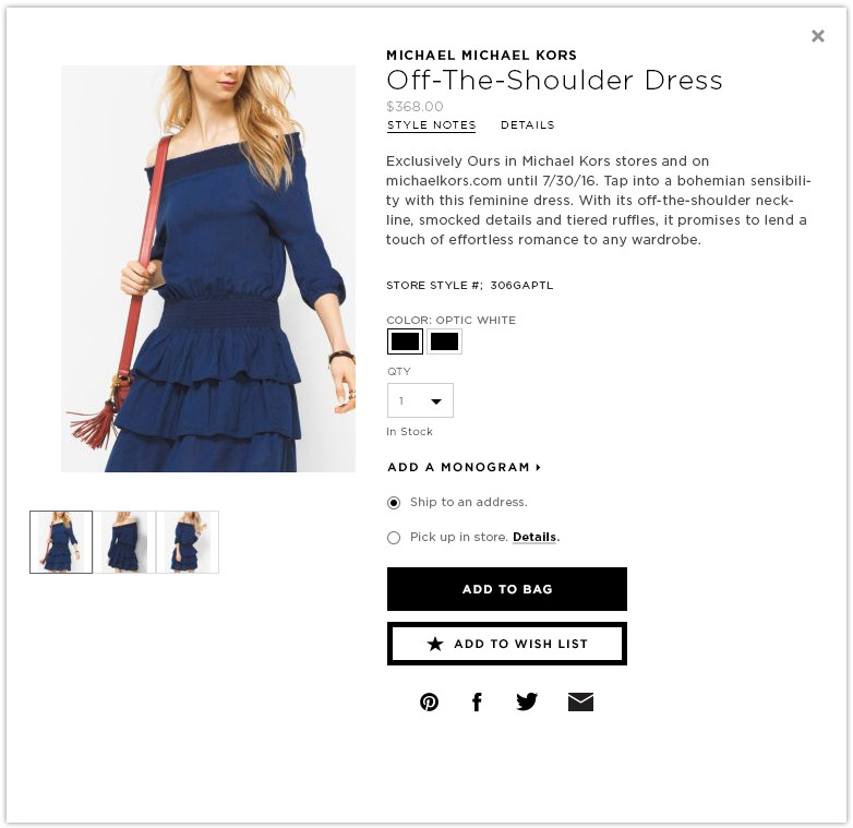
Quick View Modal
This modal should always be centered on the page, does not scroll, closes with the close button and by clicking the background. DO NOT auto open or remove the close button.
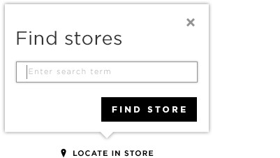
Interactive Tool Tip
On click the tool tip is activated with an interactive element. It is characterized by the gray shadow, white box and a transparent gray background.
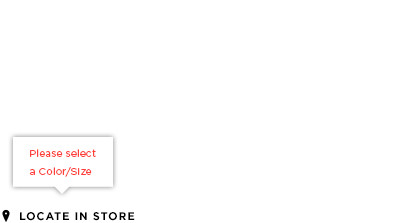
Simple Tool Tip
A simple tool tip provides information or errors without interactive elements in the overlay. It’s characterized by a white box and drop shadow, no background or close button. It deactivates once the user addresses the error.
Standard Tool Tip Template
Selectors
Adhere to the below styles when using radio buttons, drop-downs, check-boxes, thumbnail image selector and thumbnail swatch selector. These assets have been designed to improve the customer experience with a user-first approach, while maintaining the brand’s look and feel. All of our selectors are customized and are meant for both Desktop and Mobile executions.
! DO NOT Alter the design, size, color functionality or type. Do not use the native selectors. Contact Lorem Ipsum, Creative Services for any additional information.
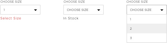
Drop Down

Radio Buttons

Radio Buttons Large
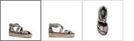
PDP Product Thumbnails
PDP Color Swatches for Desktop
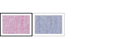
PDP Color Swatches for Mobile
Tables
Tables are a combination of rows and columns that contain data. Row and column names are set in bold. Data is set in book. Hover states of columns and rows are highlighted. The users selection is highlighted in black.
! DO NOT Alter table styles. Contact Lorem Ipsum, Creative Services for any additional information.

Dynamic Size Guide