Site Layouts
Homepage
These templates are flexible and always changing. Check in with the Experience Team for up-to-date templates. For more detailed information, please refer to the Functionality page of the InDesign file.
Contact Lorem Ipsum, UX Lorem Ipsum, Associate Producer or Lorum Ipsum from Creative Services for any additional information.

Product Landing Page - CIG
There are two dynamic templates for category grid pages with enhanced ability to feature content. Both Template A (Blue) and Template B (Red) have desktop and mobile versions that could be used for desktop, tablet and mobile. For more detailed information, please refer to the Functionality page of the InDesign file.
Contact Lorem Ipsum, UX Lorem Ipsum, Associate Producer or Lorum Ipsum from Creative Services for any additional information.
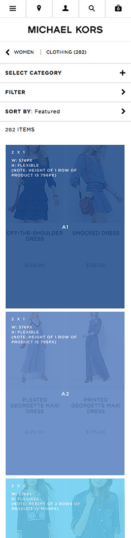
Template A - Mobile
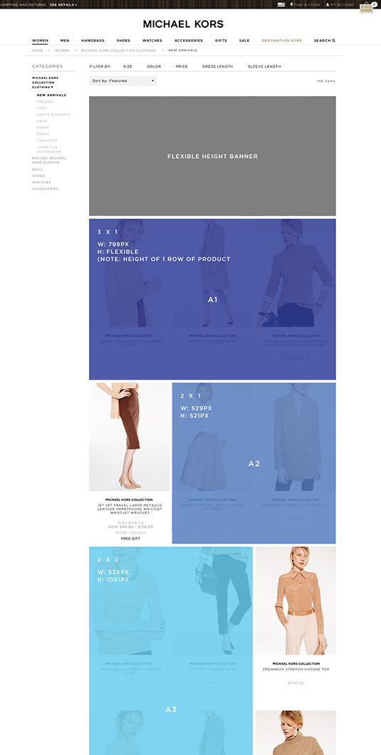
Template A - Desktop
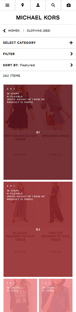
Template B - Mobile
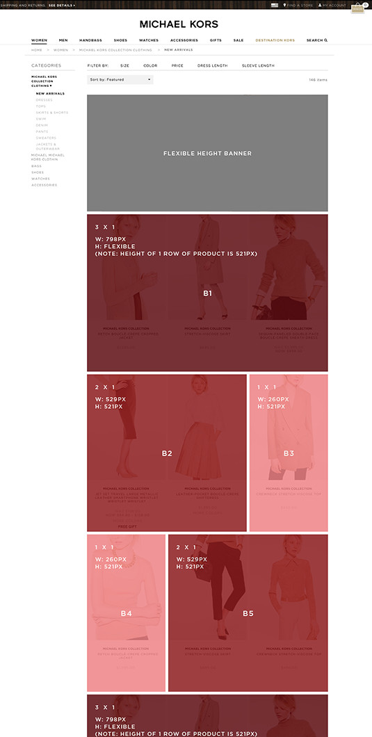
Template B - Desktop
Usage
Functionality / Usage
-
• Embed slot with static, animated and/or video content.
- – Slots can be designed to contain multiple assets.
- – Slots are rich media content enabled meaning they can contain anything, videos, html code (carousels, coded animations), gifs, or parallax animation.
- – Text and links can be coded as HTML to allow for easier translations.
- – Assets within one slot are not required to fill the whole area; white space can be used to break up the grid.
- – Slots that are the full with of the product grid on both desktop and mobile have felixble height.
- – Can use coded animations instead or gifs, to be determined by file size. (File size limit: XXX)
- – Link slot to other places within the MK site or Destination Kors.
- – If no content is assigned to a slot, products on page will shift up to fill unoccupied slot.
- – Can deliver multiple content versions for one slot & assign deployment date set to each (Example: update message as holiday deadline nears.)
- – Content can be swapped between slots via XM without changing the template when necessary for merchandising.
- – Anchor tags can be used within a slot to drive users to specific location on page.
- • Functionality of existing flexible height banner remains on desktop, but was not implemented for mobile. Can be suppressed for desktop.
- • Full row of products (3 on desktop, 2 on mobile) required below the last content slot. If not, last content slot automatically gets suppressed.
Interaction with Sorting / Filters
- • When a user sorts the listing page, the content slots remain in the same position.
- • When filters applied to the page: Top content slot (flexible height banner) should remain in place and all other content slots within the grid disappear. Filter application use cases are; the user applies a filter within a category page, user clicks on banner that includes a link to a filter selection or user is driven to a category page where a filter has been pre-selected.
Deliverables
- • Slots with both image and text -- slice out image & deliver style guide for type to be coded.
- • Live html type font options include Gotham, Caslon, or Din Dot.
- • For mobile, designers should use the 640 width template, production to deliver images from 640 template to accommodate for retina screens (actual HTML width is 320px).
Destination Kors
Destination Kors is built on the wordpress platform and are fixed templates. An archive for MK runway shows, collections and celebrity affiliations.
Email Layouts
Marketing
There are four unique sub-branding templates for the marketing emails. All templates are both mobile and desktop friendly. Adhere to the below templates for each category.
! DO NOT Alter the design, logo, color functionality or type. Do not use the native selectors. Contact Lorem Ipsum, Creative Services for any additional information.

Michael Michael Kors Emails (Mobile)
Always adhere to this template and the shadow guide for all MMK mobile emails.

Michael Michael Kors Emails (Desktop)
Always adhere to this template and the shadow guide for all MMK mobile emails.

Michael Kors Collection Emails
Coming Soon

Michael Kors Mens Emails
Always adhere to this template for Michael Kors Mens emails.

Emails Without Navigation
Coming Soon
EBM
Coming Soon